8. GUI Programming
8.1. Introduction
Fig. 8.1 Screenshot of a typical GUI program. Programs of this complexity require Object Oriented Programming techniques.
In the previous chapters of the reader all interaction between user and programs took place through text input and output. Although these text based techniques are useful in certain specialised domains, e.g. data analysis and scripting, the world of applications is dominated by so-called Graphical User Interfaces in which interactions take mainly place through the mouse. Therefore, an introduction on GUI programming is compulsory part in any serious general introduction to programming.
The field of GUI programming is highly specialised and very detailed. This brief introduction is only meant to show the reader the basic principles of GUI programming. Numerous standard elements of GUI programs like menus, pop-ups and dialog boxes have been deliberately left out for simplicity. With the programming techniques in this reader, all of these elements can be used effectively. The reader is encouraged to experiment with the numerous examples below and try to build more complex programs.
8.1.1. The Four Basic GUI Tasks
When you develop a user interface (UI) there is a standard set of four kinds of tasks that you must accomplish in any programming language:
The “Looks”.
You must specify how you want the UI to look. That is, you must write code that determines what the user will see on the computer screen. We specify how we want a GUI to look by describing the “widgets” that we want it to display, and their spatial relationships (i.e. whether one widget is above or below, or to the right or left, of other widgets). The word “widget” is the common term for “graphical user interface component”. Widgets include things such as windows, buttons, menus and menu items, icons, drop-down lists, scroll bars, and so on.
The “Work”.
You must decide what you want the UI to do. That is, you must write functions that perform the tasks of the program. The functions that actually do the work of the GUI are often called “callback handlers” or “event handlers”. “Events” are input events such as mouse clicks or presses of a key on the keyboard. These functions are called “handlers” because they “handle” (that is, respond to) such events.
The “Binding”.
You must associate (“bind”) the “Looks” with the “Work”. That is, you must write code that associates the things that the user sees on the screen so they “trigger” the functions that you have written to perform the program’s tasks. Associating an event handler with a widget is called “binding”. Roughly, the process of binding involves tying together three different things:
the widget involved (e.g. a button)
the type of event (e.g. a mouse click, or a press of the ENTER key)
the event-handler function that will do the work.
The “Event Loop”.
Finally, you must write code that sits and waits for input from the user, the so-called “event loop”.
8.1.2. An Illustrative Example
Let us first look at a relatively simple example that will illustrate the four concepts “Look”, “Work”, “Binding” and “Event Loop” that were introduced in the previous paragraph.
Suppose we want a login screen that checks the combination of a user’s name and password when a ‘login’ button is pressed. (The only correct combination being ‘Jack Sparrow’ / ‘Captain’.)
In code example 8.1 you can find a simple way of implementing such a GUI in tkinter.
 1from tkinter import * # imports all tkinter GUI definitions
 2
 3class LoginWindow():
 4    def __init__(self, root):
 5        window = root
 6        window.title("Black Pearl Login") # "Look": a title to the login window
 7
 8        self.__login_msg = Label(window) # "Looks": create a label for window
 9        # "Looks": set text of the label with .config(text = " . . . ")
10        self.__login_msg.config(text = "enter username/password (top/bottom)")
11        self.__login_msg.pack() # "Looks": # place the label inside the window
12
13        self.__username = Entry(window) # "Looks": create a text entry for window
14        self.__username.config(width = 40) # "Looks": set nr of chars ('width') to 40
15        self.__username.pack() # "Looks": place the entry inside the window
16
17        self.__password = Entry(window) # "Looks": create a text entry for window
18        self.__password.config(width = 40) # "Looks": set nr of chars ('width') to 40
19        self.__password.pack() # "Looks": place the entry inside the window
20
21        button = Button(text = "Login") # "Looks": create a button with text "Login"
22        button.config(command = self.__tryLogin) # "Binding": a click on the button triggers a call: self.tryLogin()
23        button.pack() # "Looks": place the button inside the window
24
25    def __tryLogin(self):
26        # All of the code in this handler function is "Work".
27        # It handles the click on the button by performing all necessary actions.
28        username = self.__username.get() # read username from entry self.__username
29        password = self.__password.get() # read password from entry self.__password
30        if (username == 'Jack Sparrow' and password == 'Captain'):
31            self.__login_msg.config(text = "You may enter the Black Pearl computer!")
32        else:
33            self.__login_msg.config(text = "You didn't say the magic word, savvy?")
34
35def main():
36    root = Tk() # initialise tkinter and create the main GUI window
37    window = LoginWindow(root)
38    root.mainloop() # "Event Loop": window will now wait for user clicks etc.
39
40main()
Code Example 8.1. A sample GUI program illustrating the four kinds of programming tasks in GUI design. This example shows handling of a button press and of text entered by the user.

Fig. 8.2 Screenshot of code example 8.1, a simplified login window. Elements in the window are from top to bottom: a Label widget, two Entry widgets, and a Button widget.
When you run this program, a window will apear like the one in Figure 8.2. The lines are interpreted/executed in the order of the table below. The remainder of this chapter will give more details on all of the concepts that were introduced above.
Please note that some of the variables have a prefix ‘self.’ (like ‘self.__login_msg’ and self.__username) and some do not (like ‘window’ and ‘button’). Please refer to paragraph 8.7 for an explanation on when (not) to use the prefix ‘self.’ in GUI applications.
lines |
task type |
explanation
|
|---|---|---|
1 |
- |
Any tkinter program must start by importing all classes and definitions
of tkinter
|
36 |
- |
Function Tk() initialises tkinter and returns a handle to the main window.
The handle is often called root.
|
37 |
- |
The window’s widgets are created by calling its constructor:
LoginWindow(root), __init__(self, root) is now executed.
|
6 |
Looks |
The title of the window is set to “Black Pearl Login”
|
8-21 |
Looks |
Creation, configuration and layout (pack) of the 4 widgets in the window:
self.__login_msg, self.__username, self.__password and self.__button
|
22 |
Binding |
self.__button.config(command = self.__tryLogin) “binds” a mouseclick
to self.__button. When it is clicked, self.__tryLogin() is called.
|
23 |
Looks |
Layout of widget __button. It is placed under the other widgets with pack()
|
28-33 |
Work |
These lines are executed every time the button is clicked.
The contents of the entry widgets is read and the result is displayed.
|
38 |
Event Loop |
Start of the event loop, it will react only to button click
and the default window actions (close, minimise, maximise)
|
8.2. The Event Loop
Any GUI system has a concept similar to the tkinter Event Loop. The Event Loop can conceptually be compared to a little old lady that sits all day by the window watching everything that can be seen through the window, like a neighbour that goes by, or rain that starts to fall. Most of the events she will only observe and do nothing, but to some of these events she will react (e.g. if the rain starts she will walk upstairs and check for open windows).
Likewise, after the user interface has been created, the program just “sits and waits” for user actions such as mouse clicks and key presses. This is specified in statement: root.mainloop() of code example 8.1. The statement creates an event loopin which events are continuously monitored (and acted upon if instructed beforehand by the programmer to do so, see Binding) until the main window is closed. This process is shown in figure 8.3.
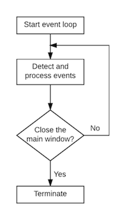
Fig. 8.3. A Tkinter GUI program listens and processes events in a continuous loop.
8.3. The “Looks”
8.3.1. Widgets
Widgets are the work horse of GUI programming, they are the visuals that can be clicked upon and that appear to do the work of the GUI or trigger it. Tkinter’s GUI classes define all common widgets such as buttons, labels, radio buttons, check boxes, entries, canvases. Table 8.1 shows some of the most commonly used widgets. Every widget is a class, so it needs to be created by calling its constructor, with at least one parameter: the so-called “parent” widget, or window to which the widget belongs visually.
Widget |
Purpose |
Button |
A simple button, used to execute a certain action on clicking it |
Entry |
A text entry field, also called a text field or a text box. |
Label |
Displays text or an image. |
Canvas |
Rectangular Widget used to draw graphs and plots. |
Frame |
Container Widget used to bundle other widgets. |
Table 8.1 The most commonly used widgets in GUI programming.
8.3.2. The three steps of widget creation
Creation of the UI widgets takes usually place in the __init__(self) function of the window class, as was already illutrated in code example 8.1. It has commonly three fases: Construction, Configuration and Layout.
Construction. Widgets are classes, so creating them is simply done by calling the constructor of the class, with the container as parameter. The container is usually referred to as the “master” or “parent”. It is usually the window (or frame) in which the new widget must be placed. Here is an example of the creation of a label, entry and frame:
. . .
self.__label = Label(window)
self.__frame = Frame(window)
self.__entry = Entry(self.__frame)
. . .
Configuration. Every Widget has many properties, which can influence the appearance (or behavior) of the widget. The adviced way to set or change a property is throught the .config() method in this way widget.config(property = value). Here are some common examples (the effect of setting the properties is explained elsewhere in this chapter):
. . .
self.__my_label.config(text = "message to the user")
self.__my_entry.config(font = "")
self.__my_button.config(command = self.__myEventHandler)
. . .
Layout. Widgets can be visually arranged in multiple ways (e.g. stacked, side-by-side) so the programmer must indicate what is the preferred arrangement. This is done with a so-called Layout Manager. The two most commonly used managers are Pack and Grid (detailed explanation of Pack and Grid can be found elsewhere in this chapter):
. . .
self.__my_label.pack(side = 'right')
self.__my_entry.grid(row = 2, column = 3)
. . .
Reading back a Widget configuration
Sometimes it can be useful to read out a configuration value from a widget. Every widget has a function widget_name.cget(“name or property”) to do this:
. . .
back_ground_color = self.__button.cget("background")
label_text = self.__label.cget("text")
. . .
Each widget class has many more properties and methods than the few examples given in this chapter. The complete information about these classes is beyond the scope of this reader. More complete information on Tkinter can be found at https://docs.python.org/3.6/library/tkinter.html.
8.3.3. The Label widget
Labels are designed to provide the user with information, like the result of a calculation or a channge of status. By default, the text in a label or a button is centered. You can change its alignment by using the justify option with the named constants LEFT, CENTER, or RIGHT. You can also display the text in multiple lines by inserting the newline character '\n' to separate lines of text. Table 8.2 shows a number of commonly used label properties.
Property |
Purpose |
text |
The text on the Label |
background (fg) |
The background color of the Label. |
foreground (bg) |
The color of the text on the Label |
font |
The text font of the label |
anchor |
The alignment of the text inside the widget (‘n’, ‘s’, ‘w’, ‘e’ etc.) |
image |
An image displayed on the label |
Table 8.2 Commonly used properties of a Label
Labels are created following the three steps (construction, configuration, layout) mentioned in the paragraph above. Code example 8.2 illustrates some of typical variations in appearance that can be controlled through .config(). The resulting UI is displayed in figure 8.4.
from tkinter import * # imports all tkinter GUI definitions

class LabelExample():
    def __init__(self, root):
        window = root
        window.title("Label Properties")

        top_label = Label(window) # create top_label in parent window
        top_label.config(text = "default label properties")
        top_label.pack() # layout top_label

        mid_label = Label(window) # create mid_label in parent window
        mid_label.config(text = "changed font properties")
        mid_label.config(font = "CourierNew 20 bold italic underline")
        mid_label.pack() # layout mid_label

        bot_label = Label(window) # create bot_label in parent window
        bot_label.config(text = "changed color properties")
        bot_label.config(background = "yellow")
        bot_label.config(foreground = "blue")
        bot_label.pack() # layout bot_label

def main():
    root = Tk()
    window = LabelExample(root)
    mainloop() # start Event Loop

main()
Code Example 8.2 Illustration of some commonly used properties of the Label widget.
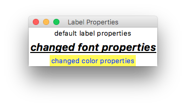
Fig 8.4 screen shot of the program in code example 8.2.
Images
Labels can also display images or photos. Code example 8.3 shows a simple way to achieve this; the result can be seen in figure 8.5. Only a few image formats are supported by tkinter (gif is one of them), but there is a module called ‘pillow’ that enables handling of many more (https://pillow.readthedocs.io/en/stable/).
from tkinter import *

class LabelImageExample():
    def __init__(self, root):
        window = root
        window.title("Image on a Label")

        self.__logo = PhotoImage(file="python_logo.gif")
        logo_label = Label(window, image=self.__logo) # create logo label in parent window
        logo_label.pack() # layout logo label

def main():
    root = Tk()
    window = LabelImageExample(root)
    root.mainloop() # "Event Loop"

main()
Code Example 8.3 Illustration of one simple way to use an image with a Label widget.
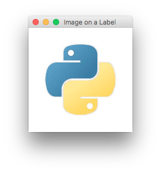
Fig 8.5 Screen shot of the program in code example 8.3.
8.3.4. The Entry widget
The main purpose of an entry widget is to allow the user to input text. How to handle the text is described elsewhere in this chapter. This paragraph only deals with how to program the “looks” of the entry. Table 8.3 shows some common properties of an Entry widget. The observant reader will notice that many properties are identical to those of the Label. Code example 8.4 and figure 8.6 show a typical example of how the default appearance of an entry is altered by the .config() function.
Property |
Purpose |
background |
The background color of the Entry. |
foreground |
The color of the text on the Entry |
font |
The text font of the Entry |
justify |
The alignment of the text in the widget; can be LEFT, CENTER or RIGHT |
width |
The width of the widget in nr of characters it can display |
Table 8.3 Commonly used properties of a Entry
from tkinter import * # imports all tkinter GUI definitions

class EntryExample():
    def __init__(self, root):
        window = root
        window.title("Entry Properties")

        top_entry = Entry(window) # create entry
        top_entry.pack() # layout entry

        bot_entry = Entry(window) # create entry
        bot_entry.config(width = 40)
        bot_entry.config(foreground = "blue")
        bot_entry.config(justify = RIGHT)
        bot_entry.config(font = "Times 24 bold")
        bot_entry.pack() # layout entry

def main():
    root = Tk()
    window = EntryExample(root)
    mainloop() # start Event Loop

main()
Code Example 8.4 Illustration of different properties of the Entry widget.
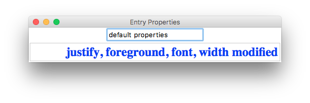
Fig 8.6 Screen shot of the program in code example 8.4. after the user has typed ‘default properties’ in the top entry and ‘justify, foreground, font, width modified’ in the bottom entry.
changing entry contents
Sometimes it is useful to change the contents of an entry to help the user. The entry widget has two methods for this pupose, .insert(…) and .delete(…):
my_entry.insert(start_index, "text to insert")
my_entry.delete(start_index, end_index) # deletes characters between start_index and end_index
my_entry.delete(0, END) # clears all text from the entry
8.3.5. The Frame widget
Frames are widgets that help in lay-out of the GUI. It is a so-called container class: the only purpose of a frame is to bundle the widgets placed in it. In this way a GUI can be build up from smaller to larger visual units. By default a frame will stretch its size to fit all the widgets in it. In code example 8.5 and figure 8.7 the examples 8.2 and 8.3 are combined into one larger layout using a frame to combine several labels.
from tkinter import * # imports all tkinter GUI definitions

class FrameExample():
    def __init__(self, root):
        window = root
        window.title("Label Properties")

        frame = Frame(window)

        top_label = Label(frame) # create top_label in __frame
        top_label.config(text = "default label properties")

        mid_label = Label(frame) # create mid_label in __frame
        mid_label.config(text = "changed font properties")
        mid_label.config(font = "CourierNew 20 bold italic underline")

        bot_label = Label(frame) # create bot_label in __frame
        bot_label.config(text = "changed color properties")
        bot_label.config(background = "yellow")
        bot_label.config(foreground = "blue")

        # layout the labels vertically in frame
        mid_label.pack()
        top_label.pack()
        bot_label.pack()

        logo = PhotoImage(file="python_logo.gif")
        logo_label = Label(window, image=logo) # create logo label in parent window
        logo_label.photo = logo

        # layout __logo_label and __frame horizontally
        frame.pack(side = 'right') # pack frame and all three labels inside at once
        logo_label.pack(side = 'right')

def main():
    root = Tk()
    window = FrameExample(root)
    root.mainloop() # "Event Loop": window will now sit and wait for user clicks etc.

main()
Code Example 8.5 Illustration of how the Frame widget can simplify GUI layout.

Fig 8.7 Screen shot of the program in code example 8.5.
‘menu bar’
Coding example 8.6 and figure 8.8 show another common use of a frame: definition and layout of a more complex unit: a ‘menu bar’ that is composed of multiple buttons.
In this particular example the status label will indicate which of the two menu button (“New” or “Open”) has been clicked upon as a form of feedback to the user. Please note that buttons ‘new_button’, ‘open_button’ and ‘about_button’ all have separate bindings to the mouse click to differentiate the handling of the three button clicks.
from tkinter import *

class MenuBarExample():
    def __init__(self, root):
        window = root
        window.title("Frame Example")
        window.minsize(480, 360)

        # create a toolbar
        toolbar = Frame(window)

        new_button = Button(toolbar)
        new_button.config(text="New", width=6)
        new_button.config(command=self.__handleNewClick)
        new_button.pack(side="left")

        open_button = Button(toolbar)
        open_button.config(text="Open", width=6)
        open_button.config(command=self.__handleOpenClick)
        open_button.pack(side="left")

        about_button = Button(toolbar)
        about_button.config(text="About", width=6)
        about_button.config(command=self.__handleAboutClick)
        about_button.pack(side="left")

        toolbar.pack(side=TOP) # pack all three buttons at once

        # create a status "bar"
        self.__status_lbl = Label(window)
        self.__status_lbl.config(width=60)
        self.__status_lbl.config(relief="solid")
        self.__status_lbl.config(borderwidth=1)
        self.__status_lbl.pack()

        self.__status_lbl.pack(side="bottom")

    def __handleNewClick(self):
        self.__status_lbl.config(text = "New button clicked.")

    def __handleOpenClick(self):
        self.__status_lbl.config(text = "Open button clicked.")

    def __handleAboutClick(self):
        self.__status_lbl.config(text = "About button clicked.")

def main():
    root = Tk()
    window = MenuBarExample(root)
    mainloop() # start Event Loop

main()
Code example 8.6 Use of a frame to create a kind of ‘menu bar’.
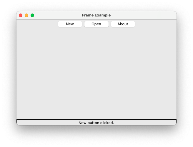
Fig 8.8 Screen shot of the program in code example 8.6 after clicking on button “New”.
8.3.6. The Canvas Widget
The canvas widget is designed to draw geometrical shapes, like lines, rectangles and circles. Here is an overview of its most common properties and methods.
Property |
Purpose |
background |
The background color of the Canvas. |
width |
The width of the widget in pixels |
height |
The height of the widget in pixels |
Method |
Purpose |
create_line(x1, y1, x2, y2, tags) |
Draw a rectangle with left x1, top y1, right x2 and bottom y2. |
create_oval(x1, y1, x2, y2, tags) |
Draw an oval with left x1, top y1, right x2 and bottom y2. |
create_rectangle(x1, y1, x2, y2, tags) |
Draw a rectangle with left x1, top y1, right x2 and bottom y2. |
create_polygon(x1, y1, …, xn, yn, tags) | Draw a polygon (x1, y1), …, (xn, yn). |
|
delete(tags) |
Deletes all objects created with the specified tag (“all” for all objects on the canvas ) |
The methods create_xxxxx have optional parameters color for line color and fill for fill color.
Code Example 8.7 illustrates how elements can be created and deleted on a Canvas widget. Figure
from tkinter import * # imports all tkinter GUI definitions

class CanvasExample():
    def __init__(self, root):
        window = root
        window.title("Properties and Methods of a Canvas")

        self.__canvas = Canvas(window)
        self.__canvas.config(width=800, height=600, background="white")

        draw_btn_frame = Frame(window)   # for layouting row of draw buttons
        clear_btn_frame = Frame(window)  # for layouting row of clear buttons

        self.create_label(draw_btn_frame, "draw ")
        self.create_button(draw_btn_frame, "world", self.draw_world)
        self.create_button(draw_btn_frame, "house", self.draw_house)
        self.create_button(draw_btn_frame, "sun", self.draw_sun)
        self.create_button(draw_btn_frame, "all", self.draw_all)

        self.create_label(clear_btn_frame, "clear ")
        self.create_button(clear_btn_frame, "world", self.clear_world)
        self.create_button(clear_btn_frame, "house", self.clear_house)
        self.create_button(clear_btn_frame, "sun", self.clear_sun)
        self.create_button(clear_btn_frame, "all", self.clear_all)

        self.__canvas.pack()
        draw_btn_frame.pack()
        clear_btn_frame.pack()

    def create_label(self, parent, lbl_text):
        lbl = Label(parent)
        lbl.config(text = lbl_text, font = "CourierNew 20 bold")
        lbl.pack(side='left')

    def create_button(self, parent, btn_text, click_action):
        btn = Button(parent, command = click_action)
        btn.config(text = btn_text, font = "CourierNew 20 bold")
        btn.pack(side='left')

    def draw_all(self):
        self.draw_world()
        self.draw_house()
        self.draw_sun()

    def draw_world(self):
        self.__canvas.create_rectangle(1, 1, 799, 299, fill='lightblue', tags="world")
        self.__canvas.create_line(1, 300, 799, 300, tags="world")
        self.__canvas.create_rectangle(1, 301, 799, 599, fill='lightgreen', tags="world")

    def draw_house(self):
        self.__canvas.create_rectangle(375, 250, 425, 300, fill='darkred', tags = "house")
        self.__canvas.create_polygon(375, 250, 425, 250, 400, 205, fill='darkred', tags = "house")

    def draw_sun(self):
        self.__canvas.create_oval(120, 90, 220, 190, fill='yellow', tags="sun")

    def clear_world(self):
        self.__canvas.delete('world')

    def clear_house(self):
        self.__canvas.delete('house')

    def clear_sun(self):
        self.__canvas.delete('sun')

    def clear_all(self):
        self.__canvas.delete('all')

def main():
    root = Tk()
    window = CanvasExample(root)
    root.mainloop() # "Event Loop": window will now sit and wait for user clicks etc.

main()
Code Example 8.7 Common Canvas methods to create a simple drawing.
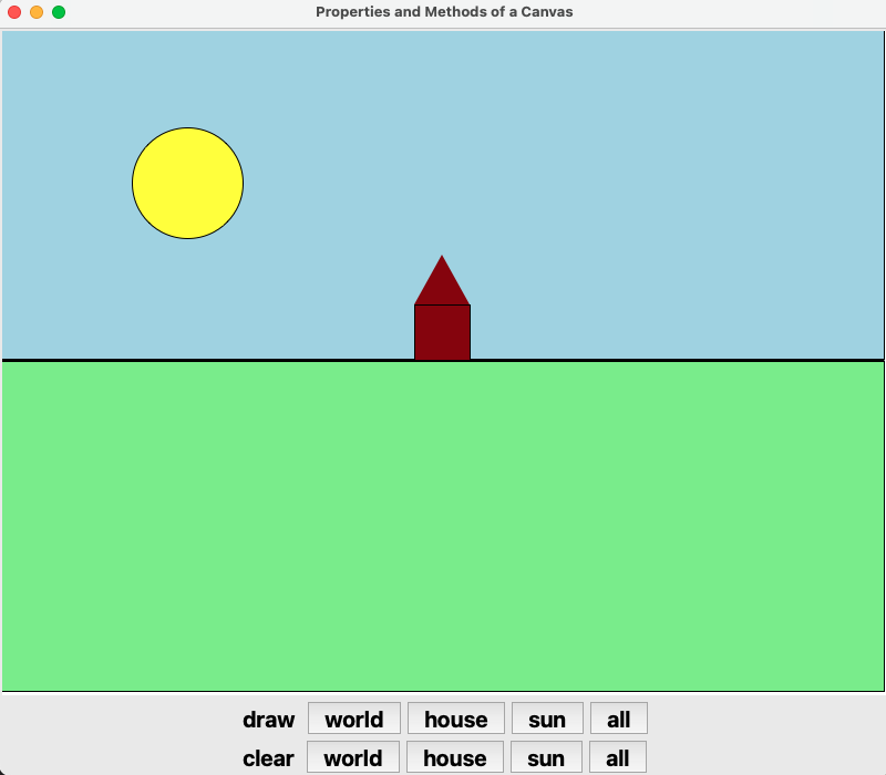
Figure 8.9 Screenshot of the program in code example 8.7 after clicking on button “all” (top-right button).
8.3.7. Layout
Since GUI programs rely heavily on the visual processing of geometrical shapes by the user, a good positioning of the widgets can make the difference between a program that is easy-to-use of one that is not. Tkinger uses three methods for positioning, also called packing managers: grid, pack and place, of which grid and pack are used the most. The quickest way to understand them is by looking at some example. One word of warning to the novice programmer: never mix the use of pack() and grid() in one widget. Doing so may confuse tkinter and let the application hang.
Grid
The Grid geometry manager places the widgets in a 2-dimensional table, which consists of a number of rows and columns. The position of a widget is defined by a row and a column number. Widgets with the same column number and different row numbers will be above or below each other. Correspondingly, widgets with the same row number but different column numbers will be on the same “line” and will be beside of each other, i.e. to the left or the right.
Using the grid manager means that you create a widget, and use the grid method to tell the manager in which row and column to place them. The size of the grid doesn’t have to be defined, because the manager automatically determines the best dimensions for the widgets used. Code example 8.8 and figure 8.10 show some of the capabilities.
In the GridDemo the Message widget is placed in row 1 and column 1 and it expands to three rows and two columns. The Get Name button uses the sticky = E option, to stick to the east in the cell so that it is right aligned with the Entry widgets in the same column. The sticky option defines how to expand the widget if the resulting cell is larger than the widget itself. The sticky option can be any combination of the named constants S, N, E, and W, or NW, NE, SW, and SE. The padx and pady options pad the optional horizontal and vertical space in a cell. You can also use the ipadx and ipady options to pad the optional horizontal and vertical space inside the widget borders.
from tkinter import *

class GridLayoutExample():
    def __init__(self):
        window = Tk()
        window.title("Grid Layout Manager Demo")

        message = Message(window)
        message.config(text = "This widget occupies three rows and two columns")
        message.grid(row = 1, column = 1, rowspan = 2, columnspan = 2)

        label1 = Label(window)
        label1.config(text = "First Name:")
        label1.grid(row = 1, column = 3)

        entry1 = Entry(window)
        entry1.grid(row = 1, column = 4, padx = 5, pady = 5)

        label2 = Label(window)
        label2.config(text = "Last Name:")
        label2.grid(row = 2, column = 3)

        entry2 = Entry(window)
        entry2.grid(row = 2, column = 4)

        button = Button(window)
        button.config(text = "Get Name")
        button.grid(row = 3, padx = 5, pady = 5, column = 4, sticky = E)

        window.mainloop()  # start listening for events


def main():
    GridLayoutExample()  # create a window object
Code Example 8.8 Illustration of layouting GUI widgets with .grid().
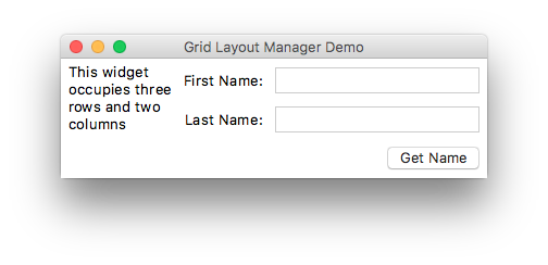
Fig. 8.10. Screen shot of the GridDemo example.
Pack
The other standard way of layouting is pack. Pack is the oldest and easiest for simple programs. Instead of having to declare precisely where a widget should appear on the display screen, we can declare the positions of widgets with the pack command relative to each other. The pack command takes care of the details. Though the pack command is easier to use, this layout manager is limited in its possibilities compared to the grid. Here is a simple Pack demo with a screenshot in coding example 8.9 and figure 8.11:
from tkinter import *

class HorizontalPackLayout():
    def __init__(self):
        window = Tk()
        window.title("Horizontal Pack Demo")

        label1 = Label(window)
        label1.config(text = "Blue")
        label1.config(bg = "blue")
        label1.pack(side = LEFT)

        label2 = Label(window)
        label2.config(text = "Red")
        label2.config(bg = "red")
        label2.pack(side = LEFT, fill = BOTH, expand = 1)

        label3 = Label(window)
        label3.config(text = "Green")
        label3.config(bg = "green")
        label3.pack(side = LEFT, fill = BOTH)
        window.mainloop()

class VerticalPackLayout():
    def __init__(self):
        window = Tk()
        window.title("Vertical Pack Demo")

        label1 = Label(window)
        label1.config(text = "Blue")
        label1.config(bg = "blue")
        label1.pack()

        label2 = Label(window)
        label2.config(text = "Red")
        label2.config(bg = "red")
        label2.pack(fill = BOTH, expand = 1)

        label3 = Label(window)
        label3.config(text = "Green")
        label3.config(bg = "green")
        label3.pack(fill = BOTH)
        window.mainloop()

def main():
    HorizontalPackLayout() # create window with horizontal packing
    VerticalPackLayout() # create window with horizontal packing

main()
Code Example 8.9 Pack demo to illustrate both vertical and horizontal layout by packing.
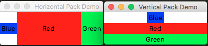
Fig. 8.11. Screenshot of the Pack demo. Left: Horizontal and right: Vertical.
Grid and Pack can be combined if needed, but always on separate widgets in the GUI. Grid is in many cases the best choice for general use, since pack is sometimes not sufficient for changing details in the layout. For a full listing of all lay-outing options the reader we refer to https://docs.python.org/3.7/library/tkinter.html.
8.4. Binding
Up to now we saw only one kind of Binding, through the “widget_name.config(command = handlerFunctionName)”. Since mouse clicks are the most common way to activate some action, this method of binding is used most often, but sometimes other ways of user input are wanted. There is a much more general form which allows the binding of any kind of widget, event and handler. This is the “bind” method. Its general form looks like this:
widget.bind(event, self.__handler)
If the specified event occurs, the handler is invoked. The event is a standard Tkinter object, which is automatically created when the corresponding real-world event occurs. Every handler has an event as its argument:
def __handler(self, event):
    print("the event was fired by widget", event.widget)
This handler will print the widget from which was “fired”.
Here are some commonly used events:
Event |
Event Description |
<Button-i> |
A mouse button is clicked. The mouse pointer’s location is available. |
<Double-Button-i> |
A mouse button is double-clicked. |
<Enter> |
The mouse pointer enters the widget. |
<Leave> |
The mouse pointer leaves the widget. |
<Key> |
A key is pressed. |
<Return> |
The Enter key is pressed. You can bind any key such as ‘A’, ‘B’, ‘Up’. |
<Shift+A> |
The Shift+A key is pressed. Can be combine with Alt, Shift, and Control. |
Every event object has a number of properties describing the event. For example, for a mouse event, the event object uses the x and y property describe the current mouse location in pixels. Some handy event properties:
Event Property |
Description |
char |
The character entered from the keyboard for key events. |
keycode |
The key code (unicode) for the key entered from the keyboard (if any) |
keysym |
The key symbol (i.e., character) for the key entered from the keyboard |
num |
The button number (1, 2, 3) indicates which mouse button was clicked. |
widget |
The widget object that fires this event. |
x and y |
The current mouse location in the widget in pixels. |
x_root, y_root |
The mouse event position relative to the upper-left corner of the screen. |
Conding example 8.10 is a simple example of how to read out the properties of the two most types of events, mouse and key events. Figure 8.12 shows in a screenshot how the event information is displayed.
from tkinter import *

class MouseAndKeyEvents():
    def __init__(self):
        window = Tk()
        window.title("Demo Mouse and Key Events")

        canvas = Canvas(window, bg = "white")
        canvas.config(width = 200, height = 100)
        canvas.pack()

        # Bind with <Button-1> and <Key> events
        canvas.bind("<Button-1>", self.__processMouseEvent)
        canvas.bind("<Key>", self.__processKeyEvent)
        canvas.focus_set()

        window.mainloop()

    def __processMouseEvent(self, event):
        print("Clicked at", event.x, event.y)
        print("Position in screen:", event.x_root, event.y_root)
        print("Button clicked:", event.num)

    def __processKeyEvent(self, event):
        print("keysym:", event.keysym)
        print("char:", event.char)
        print("keycode:", event.keycode)

def main():
    MouseAndKeyEvents()

main()
Code Example 8.10. Binding and processing Mouse and Key events.
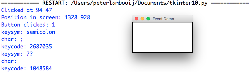
Fig. 8.12. Capturing properties of Mouse and Key events.
8.5. Event Handlers
Event handlers usually do almost all of the work of GUI applications, since the latter are designed to wait for user events before coming into actions. We have already seen a number of event handlers in the demos above: function __tryLogin(self) in code example 8.1 and functions __handleNewClick and __handleOpenClick in code example 8.6. As can be seen from these handlers, they are regular functions.
8.6. Delayed and repeated actions
8.6.1. Delayed Actions
In GUI programming the standard way to delay an action is through the “after” method:
widget_name.after(delay, handler)
As a simple code example, in example 8.11 below, the previous example of the menu bar is revisited and extended to clear the status label, 1500 ms after a status message was displayed, so the user has time to read the message before it disappears. Please run the example to see the effect in practice. The .after() method can be called on any widget (like the status label in this example).
from tkinter import *

class RepeatedActionExample:
    def __init__(self):
        window = Tk()
        window.title('use of after for repetition')

        self.__total_nr_echos = 3
        self.__ms_between_echos = 1000

        self.__nr_echos = 0
        self.__answer = ''

        # word to echo
        wordToEchoLabel = Label(window)
        wordToEchoLabel.config(text = "word to echo:")
        wordToEchoLabel.grid(row = 1, column = 1)

        self.__wordToEchoEntry = Entry(window)
        self.__wordToEchoEntry.grid(row = 1, column = 2)

        # shout button
        echoShout = Button(window)
        echoShout.config(text = "shout!")
        echoShout.config(command = self.__startEchos)
        echoShout.grid(row = 2, column = 2, sticky = ("E", "W"))

        # answer from echo well
        echoAnswerLabel = Label(window)
        echoAnswerLabel.config(text = "answer from well:")
        echoAnswerLabel.grid(row = 3, column = 1)

        self.__echoAnswer = Label(window)
        self.__echoAnswer.grid(row = 3, column = 2)

        window.mainloop()

    def __startEchos(self):
        self.__nr_echos = 0
        self.__answer = ''
        self.__echoAnswer.config(text = self.__answer)
        self.__echoAnswer.after(self.__ms_between_echos, self.__oneEcho)

    def __oneEcho(self):
        if self.__nr_echos < self.__total_nr_echos:
            word = self.__wordToEchoEntry.get()
            self.__answer += word + '...  '
            self.__echoAnswer.config(text = self.__answer)
            self.__nr_echos += 1
            self.__echoAnswer.after(self.__ms_between_echos, self.__oneEcho)
        else: # clear answer
            self.__echoAnswer.config(text = '')

def main():
    RepeatedActionExample()

main()
Code Example 8.11 Repeating an action by using the .after() method and a counter variable self.__nr_echos.
8.7. Self and Scope in GUIs
In the code examples throughout this chapter, some variables inside the class code have a prefix ‘self.’ and some variables do not. There is a logic to this: the DRY principle (here: don’t repeat ‘self.’ if it is not necessary).
Recall from 7.4 that the ‘self’ parameter extends the scope of a variable from local (it only exists in the method in which it was created) to the entire class.
In programming it is good practice to minimize the scope of a variable. Therefore, only widgets that are used in more than one method (‘def’) get the ‘self.’ prefix. With all the others the prefix is omitted, keeping the code more readable. Another advantage of this principle is that the local variables are by definition private (not accessible from code outside the class) so there is no need for the ‘__’ prefix, which also makes the code more reader-friendly.
As an example of this principle, refer to code example 8.11, where variables ‘window’ and ‘wordToEchoLabel’ do not need to be used outside method ‘__init__’ so they can be local variables (they need no prefix ‘self.’). In contrast, variables ‘self.__wordToEchoEntry’ and ‘self.__nr_echos’ are used in more than one method in the class and therefore need a prefix ‘self.__’.
© Copyright 2022, dr. P. Lambooij
last updated: Oct 18, 2022